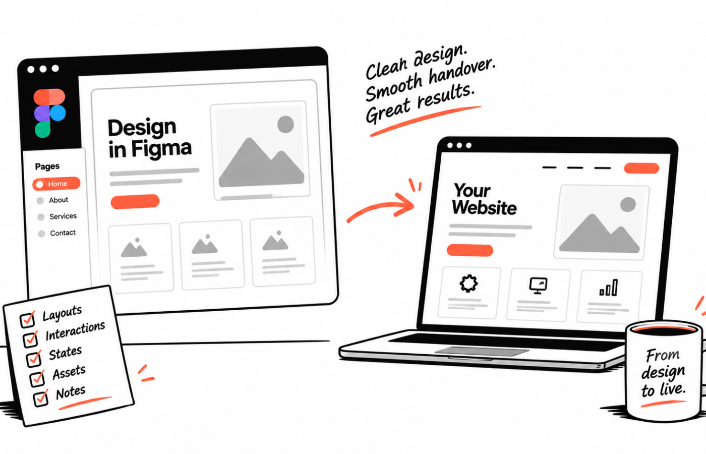
You’ve got the design to a point you’re happy with. Now someone needs to build it without quietly losing the details that make it work.
A useful handover helps. It doesn’t need to become a second design project.
I want to understand what’s approved, how the pages behave and which decisions still need a conversation. A tidy file is welcome, but clarity matters more than perfect layer names.
Tell me which version I’m looking at
Design files can collect a lot of history. There may be several homepages, an abandoned direction and a mobile layout that hasn’t caught up with the latest changes.
Point me towards the version intended for development. If some sections are still being discussed with the client, mark those clearly.
That saves us from building something that looks finished but isn’t approved.
It also helps to know who can answer questions. If the agency owns the design decisions, I’d rather raise an uncertainty with the right person than make a change the client wasn’t expecting.
Explain what a screenshot can’t show
An open menu doesn’t explain how it opens. A project card doesn’t necessarily tell me whether the whole card is clickable or only the button.
Notes are often enough. A short description of the intended behaviour can be more useful than a complicated prototype, particularly for a simple interaction.
For anything unusual, a prototype or screen recording may make the idea much clearer. Tell me what matters about it. Is it the timing, the direction of movement or the way content appears?
We can then work out how it should behave on devices without hover, and for people who prefer less movement.
Show the less flattering states
Show the less flattering states
Illustrative example
Success
Thanks — your message is with the studio.
Error
Add a valid email so we can reply.
Empty state
No projects match these filters yet.
A form with every field completed neatly is only one version of that form.
What happens when something is missing? What does the success message say? If there is search or filtering, what appears when there are no results?
Those states need decisions too. You don’t have to design every one before getting in touch, but we should agree who is handling them.
I’d also like to see realistic content. Long project names and uneven descriptions reveal things that perfectly balanced sample text can hide.
Give mobile some direction
You don’t need a mockup at every possible screen width. A website has to adapt between designs anyway.
But if a section needs a different order or a particular mobile treatment, show me. Otherwise I’m making a design decision from the desktop layout.
Sometimes that’s part of the agreed job, and I’m happy to work through it. Sometimes the designer already has a specific intention. The handover should make the distinction clear.
Also flag anything that must remain prominent on a phone. That can affect the layout more than simply scaling down the typography.
Include the assets the build actually needs
I need access to the images and logos intended for use, along with the font details and confirmation that the necessary web use is covered.
An image embedded in a mockup may not be the final asset. If it’s a placeholder, say so. If the client is still arranging photography, we need to allow for that in the schedule.
Useful notes about cropping can save time as well. A portrait that looks right on desktop may need a different focal point on mobile.
Don’t forget the person editing it
The design shows what the content looks like. We also need to understand where it comes from.
Will the client add these cards manually? Should the latest projects appear automatically? Can they reorder a section, or is that deliberately fixed?
These choices affect the build and the handover. They also help preserve the design once real people start maintaining it.
I like to discuss this before development is far along. It’s much easier to build the right editing controls when we know the intended workflow.
A short walkthrough can settle a lot
Send the file and explain what still needs attention. We can go through the important pages, flag missing states and agree where I should make practical decisions.
You don’t need to document every obvious thing. You do need to surface the decisions that would be expensive or frustrating to misunderstand.
That’s what a good handover is for.
A short handover list
Useful prompts, not a mandatory submission standard.
- Which version is approved for development
- Notes for interactions a screenshot cannot show
- Empty, error and success states, or who will decide them
- Mobile direction where the layout should change
- Final assets, fonts and anything still placeholder
- How the content will be edited after launch