Someone has found a product they might want. They like the photograph, the price seems reasonable and they're still on your website.
That doesn't mean they're ready to buy.
They may be trying to work out whether it fits, when it will arrive or which option they're supposed to choose. The answers might exist somewhere on the site. If finding them becomes a job, you risk losing someone who was interested a moment ago.
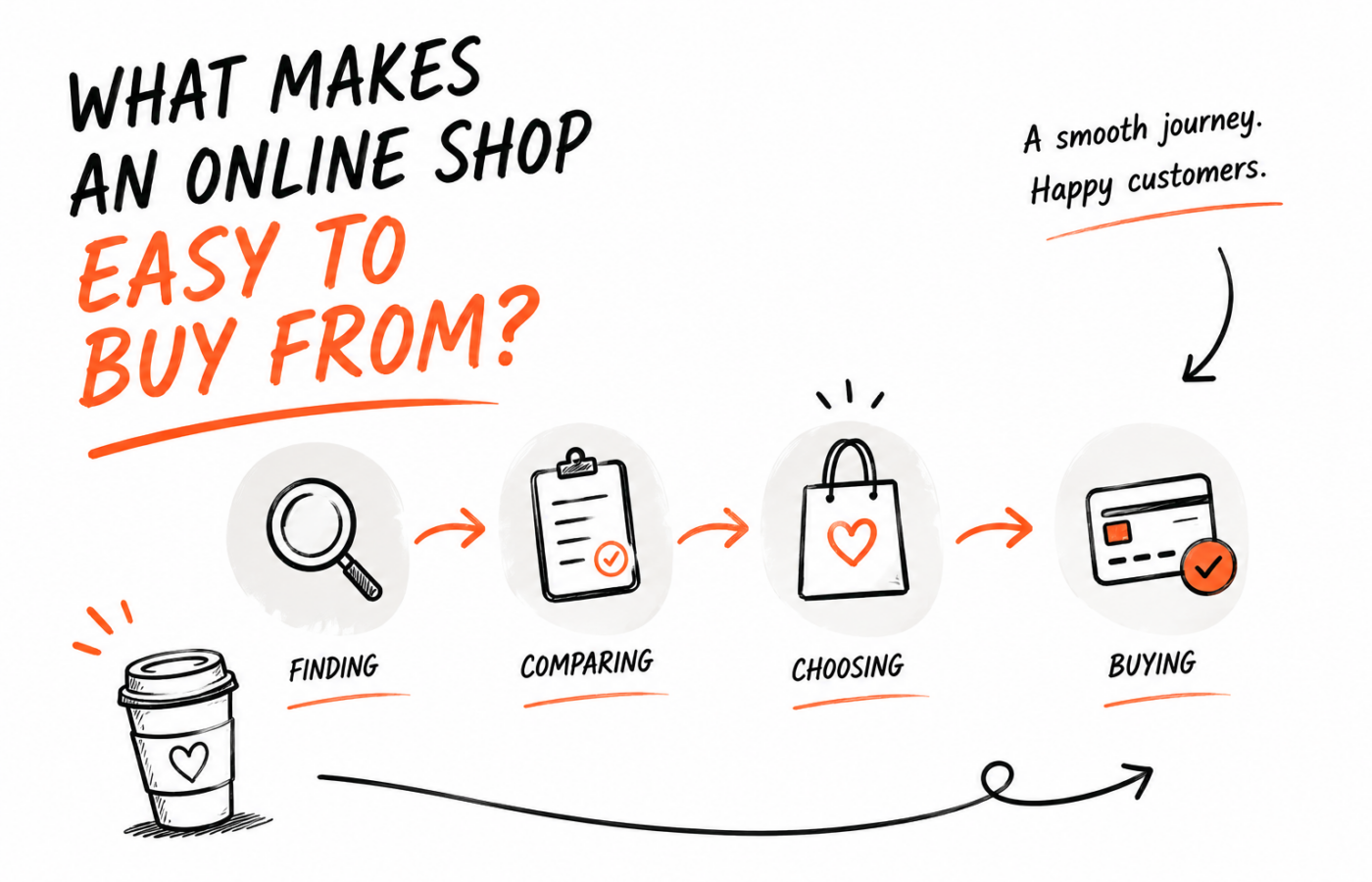
When I look at an online shop, I want to follow the buying journey properly. A good-looking product page is part of it. So is what happens when the customer changes the size and the price updates.
- Finding
- Comparing
- Choosing
- Buying
Finding the right product comes first
Your customers may not organise products in the same way you do internally.
You might think in supplier names or product codes. They might think in sizes, uses or the space they have available. The navigation needs to make sense from their side.
For a small range, that may be quite simple. For a larger catalogue, categories and filters deserve proper attention. A filter is useful when it removes options the customer genuinely can't use, rather than adding another control to the page.
Imagine buying a desk for a narrow room. Width could matter more than the collection it belongs to. If width is hidden inside individual descriptions, you have to open product after product to find something suitable.
That's a content and organisation problem before it's a design problem.
A product card should help someone choose where to look
You don't need the whole description on a category page. You do need enough information for someone to decide which product is worth opening.
A clear image and name are the start. Depending on what you sell, a key dimension or availability detail may be more useful than a decorative badge.
Be careful with prices for products that have options. If the displayed price only applies to one version, make that understandable. A customer who repeatedly opens products and discovers that the version they need costs much more may lose patience.
The card is setting expectations. The product page should make those expectations clearer, not overturn them.
Show what the customer needs to see
One beautiful photograph isn't always enough.
A person buying clothing may want to understand the fit. Someone buying furniture may need to see the back or how a drawer opens. A close-up could answer a question about material that several paragraphs would struggle to explain.
Choose images because they help someone make a decision. You can still make the gallery look good.
Also consider the smaller screen. Can the customer inspect the detail? Is the image cropped so tightly that part of the product disappears? Does selecting a colour show the relevant version, where suitable images exist?
If an image includes accessories that aren't supplied, make the contents of the purchase clear nearby. Don't rely on someone discovering that distinction after delivery.
Product copy has a practical job
“Premium quality, designed with you in mind” doesn't answer much.
What is the product made from? How large is it? Does it need assembling? The useful questions will depend on what you're selling, and you probably already hear some of them from customers.
Start there.
You don't have to turn every page into a long essay. A short explanation followed by clear specifications can work well. A more complicated product may need a guide or a diagram. The amount of information should match the decision being made.
I would also separate a genuine product difference from a sentence that's repeated everywhere. If every item is described as exceptional, the description isn't helping anyone choose between them.
Options should be understandable before the customer clicks
Illustrative example
Wool runner rug
Selected variation
160 × 230 cm
Current price
£189
Delivery information
Order today for dispatch this week
Size, colour and other variations can make an otherwise straightforward purchase confusing.
Labels need to mean something to a customer. Internal abbreviations might be useful in your stock system, but that doesn't make them useful beside an Add to basket button.
When a selection changes the price, the displayed price should update clearly. If a combination is unavailable, the page should explain that without making the customer guess which choice caused the problem.
I'd test several combinations, including ones that are unavailable. Then I'd check the basket to make sure the selected details have carried through correctly.
This is an easy place for a polished shop to become frustrating. The default version works, so everyone assumes the product works. The customer chooses something different and discovers otherwise.
Will it fit? Or: when will it arrive?
Delivery information belongs in the decision
If I need an item for Friday, knowing whether you can deliver it matters before I pay.
Give people useful information about delivery timing and cost as early as your setup allows. If the final amount depends on their location, explain that and provide a sensible way to check it.
There is a difference between “in stock” and “ready to arrive tomorrow”. Customers may not know how your dispatch process works. Tell them enough to avoid a misleading impression.
For made-to-order items or larger deliveries, a short explanation near the buying controls can be more useful than a detailed policy buried in the footer.
Returns information also needs to be easy to find and accurate for what you sell. Get the policy right for your business first, then present it clearly. A reassuring sentence can't replace an actual policy.
The basket should confirm the decision
Once an item is added, the customer should be able to check what they've chosen.
Show the relevant options in plain language. Make quantity changes understandable, including any limits. If they remove something, the result shouldn't leave them wondering whether it worked.
This is also a moment to be restrained with extra offers.
A relevant accessory might help. A crowded layer of pop-ups and unrelated suggestions can make someone feel as though the shop is fighting their attempt to finish.
You don't have to stop selling once a product reaches the basket. Just keep the customer's original task easy to complete.
Checkout needs a proper attempt
Don't review checkout by looking at its first screen and deciding it seems fine.
Use an appropriate test process and follow the purchase through. Try it on a phone. Make a small mistake in a field and see whether the message tells you how to correct it.
If the platform allows guest checkout and it suits the business, consider whether requiring an account is necessary. Ask only for information the transaction or service needs. Every extra question should have a reason to be there.
The exact controls depend on the platform and configuration, so this is something to assess in the actual shop. A design suggestion is only useful if it can be implemented properly.
After completion, check what happens beyond the page. The customer should receive the right confirmation, and the business should have the order information it needs to fulfil the purchase.
Use real customer questions to improve the shop
You don't need to guess forever.
Keep a note of questions that arrive before an order and problems reported afterwards. If several customers ask the same thing, look at where that information belongs in the buying journey.
It may be a product detail. It may be an unclear delivery message or a choice that needs a better label.
These changes are often quite ordinary. They can still make a meaningful difference to how confidently someone uses the shop. Measure the effect where you can, without assuming every change will increase sales.
Begin with one product
Choose something representative of what you sell. Start from the category page and try to buy it as someone who doesn't already know the answer to every question.
Write down each moment of hesitation. Don't fix everything immediately; first understand where the uncertainty comes from.
That gives you a practical starting point for improving the shop. You may need a design change, better product information or a fix to the way options work.
The aim is to help someone make a considered purchase without the website making it unnecessarily difficult.
Begin with one product
Start from the category page and write down each moment of hesitation. Four observations is enough to start.
- 1 What made you hesitate?
- 2 What information was missing?
- 3 Which choice was unclear?
- 4 What would make the next step easier?